Employee Benefits
Branding | Copywriting | Print Collateral | Typography
Adobe InDesign, Adobe Photoshop
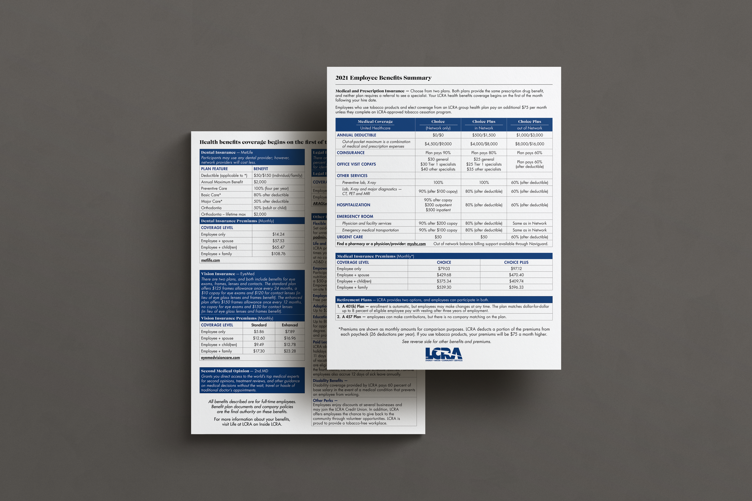
Since before my time as an in-house designer at the Lower Colorado River Authority, the company had used the Employee Benefits Summary – a standard, double-sided, 8.5x11” sheet of paper packed full of text to share medical premiums and other important, high-level benefits-related information with current employees as well as prospective hires to encourage them to apply. Seeing the potential of what this could be and inspired by large changes to the benefits being offered to employees, I created an expanded version of this document to better showcase a holistic view of what it’s like to work at LCRA and how robust the accompanying employee benefits package is.
After sorting the LCRA employee journey into three distinct groups based on their knowledge and access to information – potential employees being recruited, newly-hired employees and current longer-term employees – I reworked the original document completely, speaking directly to the first group (potential employees) to show them why they should want to work here.
Before
Initially, this document was cramped and didn’t accurately show what makes LCRA unique. It was missing the people-centric, community-driven soul that is at the core of the company and, though in-brand, it didn’t really speak to the company’s mission, “To enhance the quality of life of the Texans we serve through water stewardship, energy and community service.”
Details
Before I started I made sure to outline the purpose of the document, the audience I was trying to appeal to and how I could make the document and therefore the company feel accessible, relatable and like a place you want to be.
Goal
Tell LCRA’s story in a unique and compelling way, showing a more comprehensive view into the culture of the company.
Showcase how great the benefits are to make potential hires say “I want to work there.”
Audience
Potential employees – people who have not been hired yet.
Tone
Speak casually, friendly, and reflective of the real people who work at the company.
Break down what can often be complex HR language and terms that can be difficult to know into normal, accessible words anyone can confidently understand.
After
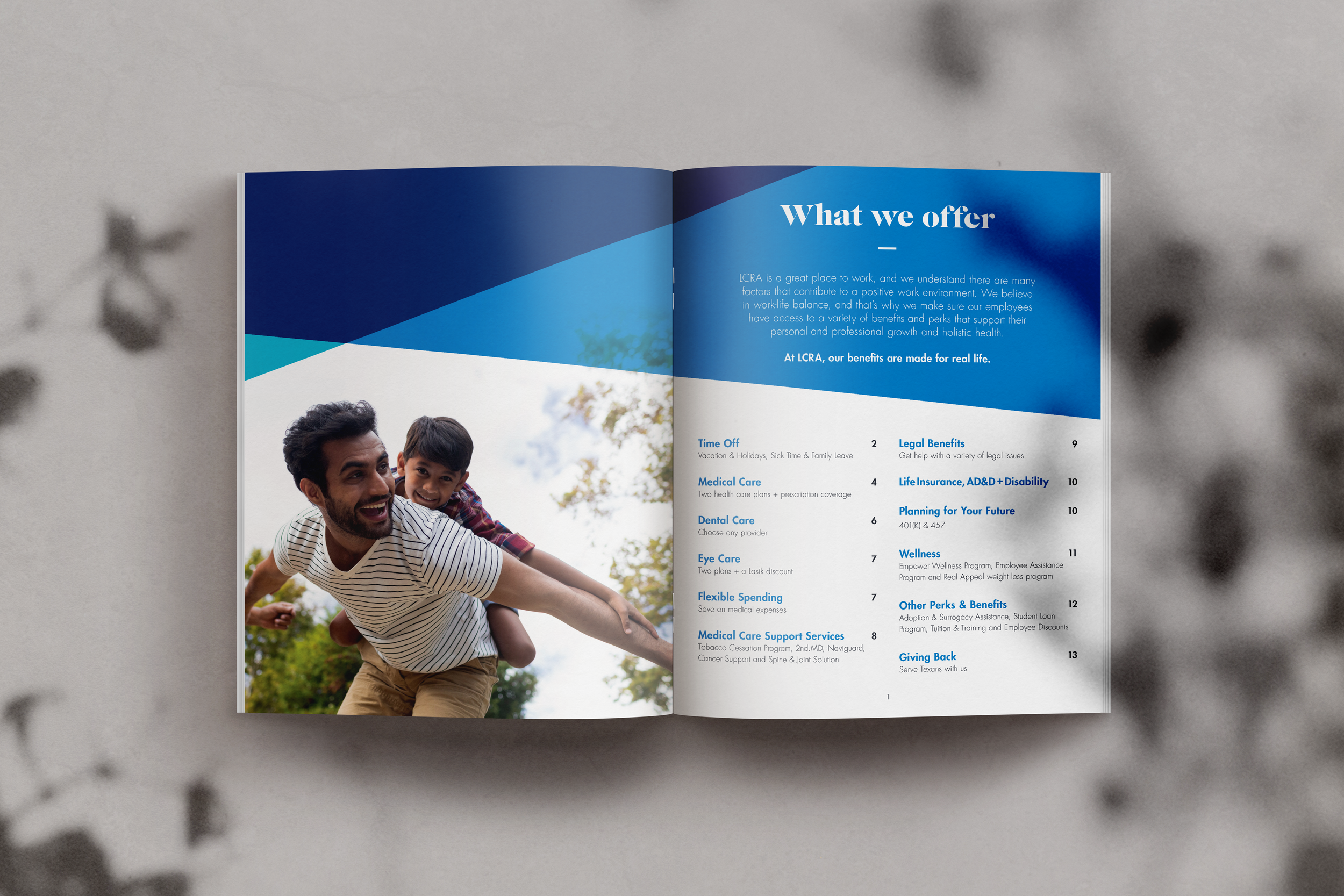
The final document is a 16-page softbound booklet that can be either printed and bound saddle stitch or viewed digitally – as the sections on the table of contents page are jump-linked in the digital version for easier use – and features large full-color photos of real employees performing a sampling of the diverse jobs performed across the company.
I structured the book to start with what information the reader might know at this point from preliminary research – what LCRA does in a general sense and its mission to serve Texans – on the cover, and then lead into what they likely don’t.
With a broader company-focus on the importance of work-life alignment, I started the main part of the book with a full spread on Time Off to immediately reinforce that message, followed by medical information, which is also very important to most people as they job search and compare possible employers.
The book leads into the natural progression of medical and health-related sections, showcasing employee diversity and in-brand colors throughout.
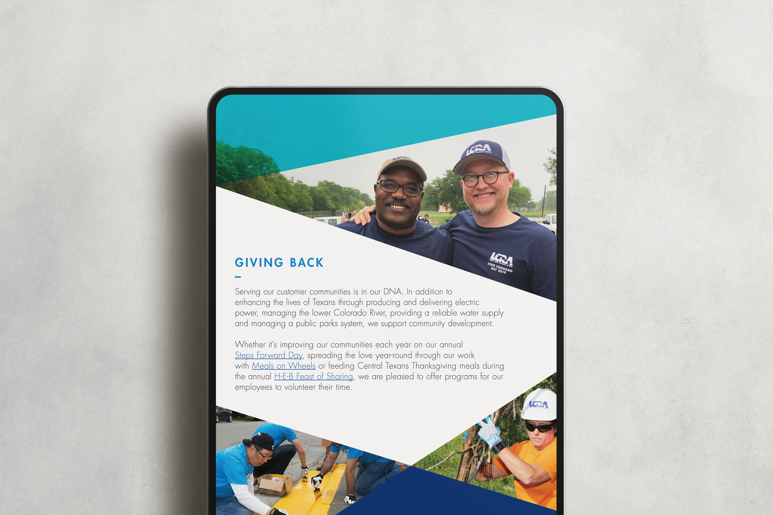
Finally, the last page in the book ends with a message on Giving Back – one of LCRA’s five foundation values. As well as an added benefit of employment, the message of volunteering ties the book together with the company’s mission and why LCRA exists.
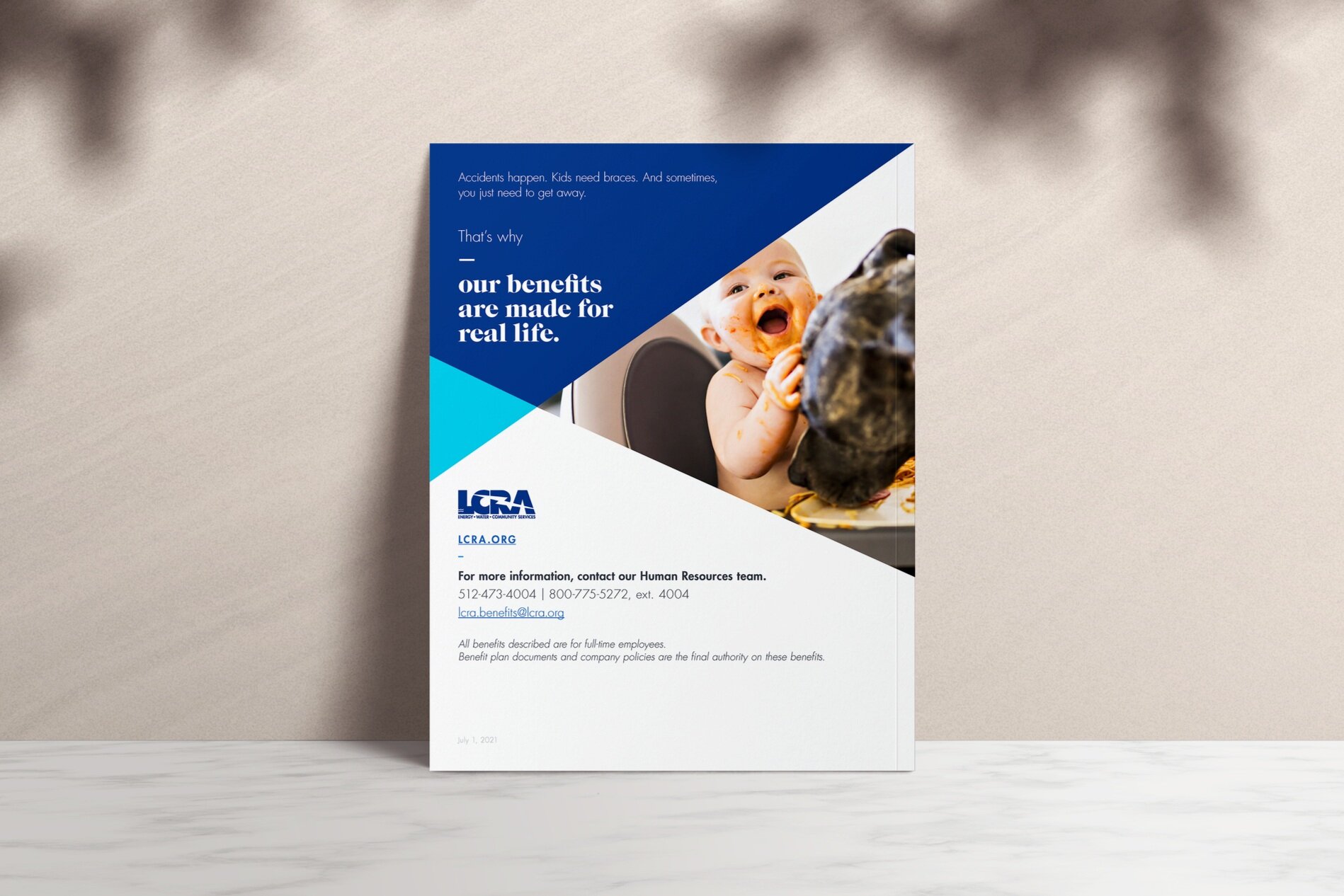
The back cover lightheartedly reiterates the benefits LCRA offers and displays contact information to continue steps to become an employee.


